Baylee Froerer

Tier Navigation Redesign
Redesigned the app’s Tier 1 & 3 navigation to reduce search abandonment, resulting in a 7 percent increase in task success and fewer clicks to product discovery compared to the mobile site experience.
Overview

Overstock.com
Problem Statement & Summary:
During the early stages of a new app launch, I led the redesign of Tier 1 navigation after data showed users abandoning search within app taxonomies. Working as the sole designer alongside product, marketing, and engineering, I helped establish a scalable navigation model informed by existing site performance and constrained development resources.
Team:
- Product designer
- Lead UX designer
- Product Manager
- 3 Engineers
Timeline:
4 weeks

E-Commerce

Mobile App Design

B2C
Competitive Analysis

Business Goals:
- Increase product findability and average cart size
- Reduce manual effort for Marketing by maintaining the existing site taxonomy model
- Align app tier navigation with the company’s updated design system
- Surface product level information earlier in the customer journey
Project Constraints:
- Limited historical data for existing app tier navigation
- Limited engineering capacity, requiring reuse of existing patterns and code where possible
- Need to balance innovation with consistency across app and mobile site experiences
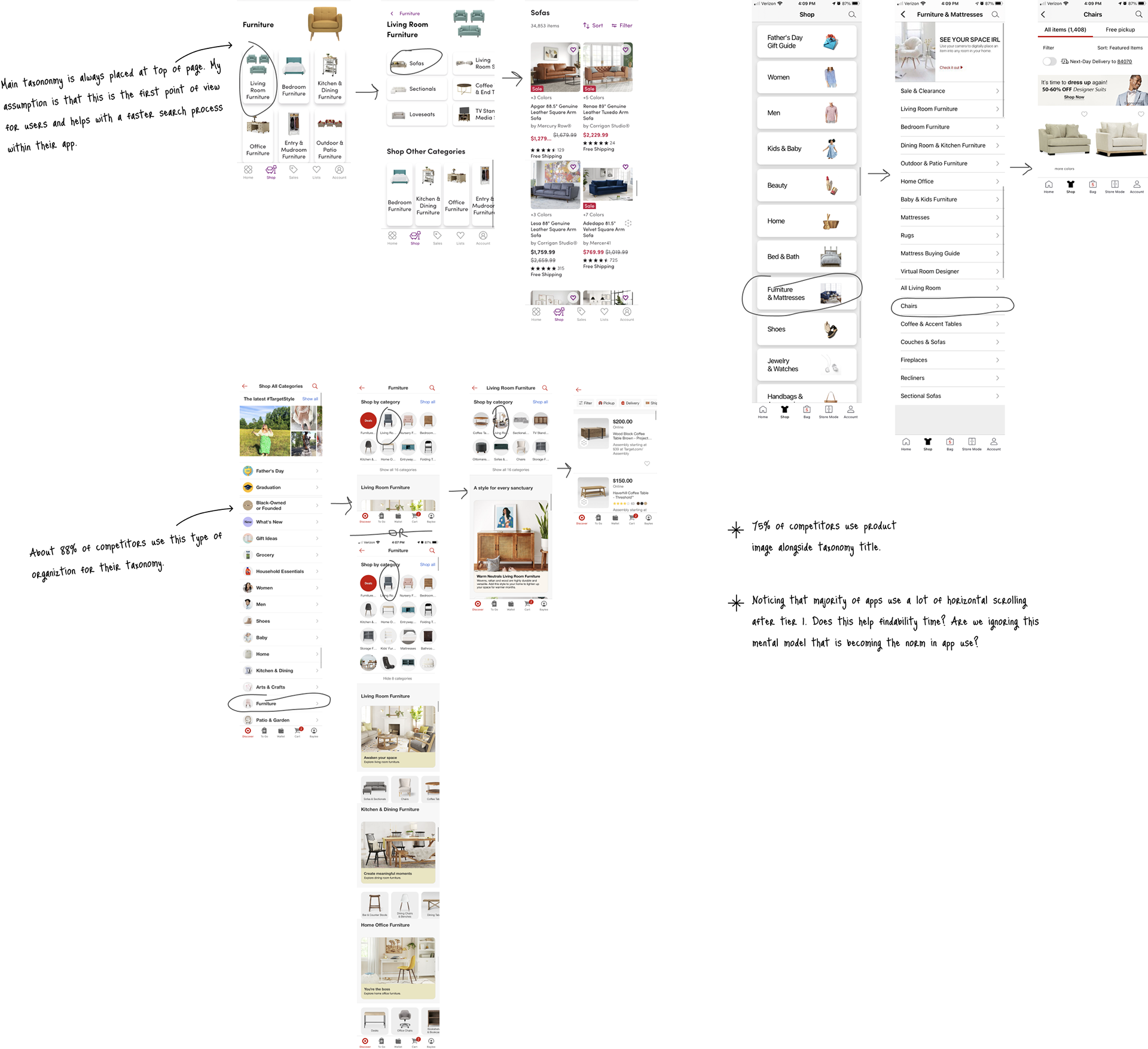
Analyzed 10 competitors to understand common taxonomy and navigation patterns. These insights informed structural and visual decisions for the new app design.
Key findings:
- 88% of competitors used vertically stacked navigation layouts
- 75% paired taxonomy titles with product imagery
Competitor Analysis Figjam Board
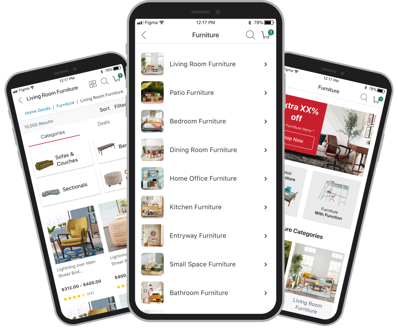
Lo-Fidelity Prototypes & Iterations

Created two low-fidelity prototypes that incorporated competitor insights and mirrored the mobile site’s marketing layout. Collaborated closely with Marketing and Product to remove low-value elements such as SEO-driven blog content and low-ROI features like “Shop by Feature.” Taxonomies were ordered by product popularity to reduce search time.
User Testing & Findings

Mobile Site Prototype - User test A
New Design Prototype - User test B
Conducted click testing in UserZoom with 200 participants, comparing the new app Tier 1 & 3 designs against the mobile site experiences. Measured task success rate, number of clicks, and time to product discovery, supported by qualitative feedback.
Results on new design vs. Mobile site:
- 7 percent increase in task success rate
- 1.8 fewer clicks on average to reach product pages
Findings supported moving the new proposed design forward to production.
Conclusion & Next steps

The redesigned Tier 1 & 3 navigation improved product findability, reduced user effort, and provided a validated framework for scaling tier navigation across the app.
Final Design Prototype
Possible next steps:
Qualitative feedback revealed confusion around the “Shop More” section at the bottom of the Tier 1 page. This insight identified a clear next step to evaluate whether the feature was redundant or misaligned with user intent, informing future optimization and experimentation.
©Baylee Froerer
• 2026 • Remade far too many times to count
Baylee Froerer

Tier Navigation Redesign
Redesigned the app’s Tier 1 & 3 navigation to reduce search abandonment, resulting in a 7 percent increase in task success and fewer clicks to product discovery compared to the mobile site experience.
Overview

Overstock.com
Problem Statement & Summary:
During the early stages of a new app launch, I led the redesign of Tier 1 navigation after data showed users abandoning search within app taxonomies. Working as the sole designer alongside product, marketing, and engineering, I helped establish a scalable navigation model informed by existing site performance and constrained development resources.
Team:
- Product designer
- Lead UX designer
- Product Manager
- 3 Engineers
Timeline:
4 weeks

E-Commerce

Mobile App Design

B2C
Competitive Analysis

Business Goals:
- Increase product findability and average cart size
- Reduce manual effort for Marketing by maintaining the existing site taxonomy model
- Align app tier navigation with the company’s updated design system
- Surface product level information earlier in the customer journey
Project Constraints:
- Limited historical data for existing app tier navigation
- Limited engineering capacity, requiring reuse of existing patterns and code where possible
- Need to balance innovation with consistency across app and mobile site experiences
Analyzed 10 competitors to understand common taxonomy and navigation patterns. These insights informed structural and visual decisions for the new app design.
Key findings:
- 88% of competitors used vertically stacked navigation layouts
- 75% paired taxonomy titles with product imagery
Competitor Analysis Figjam Board
Lo-Fidelity Prototypes & Iterations

Created two low-fidelity prototypes that incorporated competitor insights and mirrored the mobile site’s marketing layout. Collaborated closely with Marketing and Product to remove low-value elements such as SEO-driven blog content and low-ROI features like “Shop by Feature.” Taxonomies were ordered by product popularity to reduce search time.
User Testing & Findings

Mobile Site Prototype - User test A
New Design Prototype - User test B
Conducted click testing in UserZoom with 200 participants, comparing the new app Tier 1 & 3 designs against the mobile site experiences. Measured task success rate, number of clicks, and time to product discovery, supported by qualitative feedback.
Results on new design vs. Mobile site:
- 7 percent increase in task success rate
- 1.8 fewer clicks on average to reach product pages
Findings supported moving the new proposed design forward to production.
Conclusion & Next steps

The redesigned Tier 1 & 3 navigation improved product findability, reduced user effort, and provided a validated framework for scaling tier navigation across the app.
Final Design Prototype
Possible next steps:
Qualitative feedback revealed confusion around the “Shop More” section at the bottom of the Tier 1 page. This insight identified a clear next step to evaluate whether the feature was redundant or misaligned with user intent, informing future optimization and experimentation.
©Baylee Froerer
• 2026 • Remade far too many times to count

Baylee Froerer

Tier Navigation Redesign
Redesigned the app’s Tier 1 & 3 navigation to reduce search abandonment, resulting in a 7 percent increase in task success and fewer clicks to product discovery compared to the mobile site experience.
Overview

Overstock.com
Problem Statement & Summary:
During the early stages of a new app launch, I led the redesign of Tier 1 navigation after data showed users abandoning search within app taxonomies. Working as the sole designer alongside product, marketing, and engineering, I helped establish a scalable navigation model informed by existing site performance and constrained development resources.
Team:
- Product designer
- Lead UX designer
- Product Manager
- 3 Engineers
Timeline:
4 weeks
E-Commerce
Mobile App Design
B2C
Competitive Analysis

Business Goals:
- Increase product findability and average cart size
- Reduce manual effort for Marketing by maintaining the existing site taxonomy model
- Align app tier navigation with the company’s updated design system
- Surface product level information earlier in the customer journey
Project Constraints:
- Limited historical data for existing app tier navigation
- Limited engineering capacity, requiring reuse of existing patterns and code where possible
- Need to balance innovation with consistency across app and mobile site experiences
Analyzed 10 competitors to understand common taxonomy and navigation patterns. These insights informed structural and visual decisions for the new app design.
Key findings:
- 88% of competitors used vertically stacked navigation layouts
- 75% paired taxonomy titles with product imagery
Competitor Analysis Figjam Board
Lo-Fidelity Prototypes & Iterations

Created two low-fidelity prototypes that incorporated competitor insights and mirrored the mobile site’s marketing layout. Collaborated closely with Marketing and Product to remove low-value elements such as SEO-driven blog content and low-ROI features like “Shop by Feature.” Taxonomies were ordered by product popularity to reduce search time.
User Testing & Findings

Mobile Site Prototype - User test A
New Design Prototype - User test B
Conducted click testing in UserZoom with 200 participants, comparing the new app Tier 1 & 3 designs against the mobile site experiences. Measured task success rate, number of clicks, and time to product discovery, supported by qualitative feedback.
Results on new design vs. Mobile site:
- 7 percent increase in task success rate
- 1.8 fewer clicks on average to reach product pages
Findings supported moving the new proposed design forward to production.
Conclusion & Next steps

The redesigned Tier 1 & 3 navigation improved product findability, reduced user effort, and provided a validated framework for scaling tier navigation across the app.
Final Design Prototype
Possible next steps:
Qualitative feedback revealed confusion around the “Shop More” section at the bottom of the Tier 1 page. This insight identified a clear next step to evaluate whether the feature was redundant or misaligned with user intent, informing future optimization and experimentation.
©Baylee Froerer
• 2026 • Remade far too many times to count